
Parts of a New Brooks Running PR Campaign: Stationary Package
- jasonpannell0
- Oct 13, 2022
- 2 min read
Its done! The collateral material to a fictitious PR campaign is done. To build on Brooks' brand, I made a stationary package consisting of a new slogan, a business card design, letterhead and an envelope design. Listed below are more details on each of these designs.
1. Business Card Design and New Slogan
________________________________________

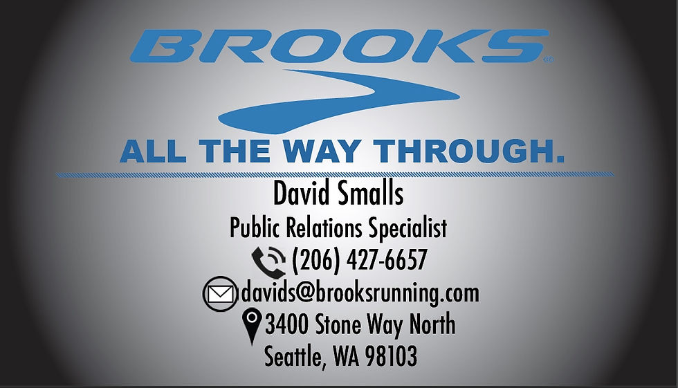
The screenshots above is the front and back, respectively, of my Brooks Running business card design.
After an in-depth competitive analysis of Brooks' brand design, I concluded that Brooks' strongest competitors have aggressive copy font and design. To help compete with other strong organizations, I designed Brooks' new copy with strength and aggression in mind. Prior to my fictitious design, the brand used a gleeful font called "happy feet," to go along with their "Run Happy" slogan.
To help build an aggressive look, I designed the logo around solid dark colors. The new slogan I made, "All the Way Through," matches the attempted aggression of the new design. "All the Way Through," comes from personal experience. Teammates and coaches who see a fellow runner approach a finish line encourage them to keep running hard all the way through to the finish line. To maintain some of Brooks' design identity, I kept their cerulean color for the logo and slogan. In the next few designs, the changes I've made are consistent.
2. Letterhead and Envelope Design.

The screenshots above show my letterhead and both sides of my envelope design.
In these designs, the black and gray gradient is gone. I found it to be visually displeasing. The solid gray and cerulean give the design a clean look. It also isn't too busy in color and features. To add some texture to the static design, I added hash mark dividers which highlight certain words, sections and icons.
For the letterhead specifically, I made sure to add the new slogan directly under the logo. This was to maintain continuity from the business card. I also made sure to make the content of each design realistic. Since Brooks Running is based in Seattle, WA, I made sure to send a pretend thank you letter to a local news anchor. Kelly Hanson is who I chose for this imaginary scenario because her about page on KING5's website says she likes to be active. Just a little bit of target audience practice! Using Kelly for this project, I made sure use her place of business for the address.
For Brook's address, I wanted texture on the envelope, so I added hash mark dividers agian. The back of the envelope is my favorite because of its simplicity. Its bold, clear and adds an artistic surprise to anyone fortunate enough to flip the envelope over. With the function of an envelope in mind, I placed the logo on the flap and the slogan on the bottom. This way, even when people tear off the flap to open the envelope, a piece of the brand is still there.


Comments